Process
I'm not really sure as to what I wanted to go for but I wanted a caroussel storyboard effect with dots under the images to select the images so that you can go back to whichever image you wanted. It was conusing at first with mainly the Javascritp.
On top of that I wanted to add text under each image so that the reader can tell what's going on in the story.
Sketch
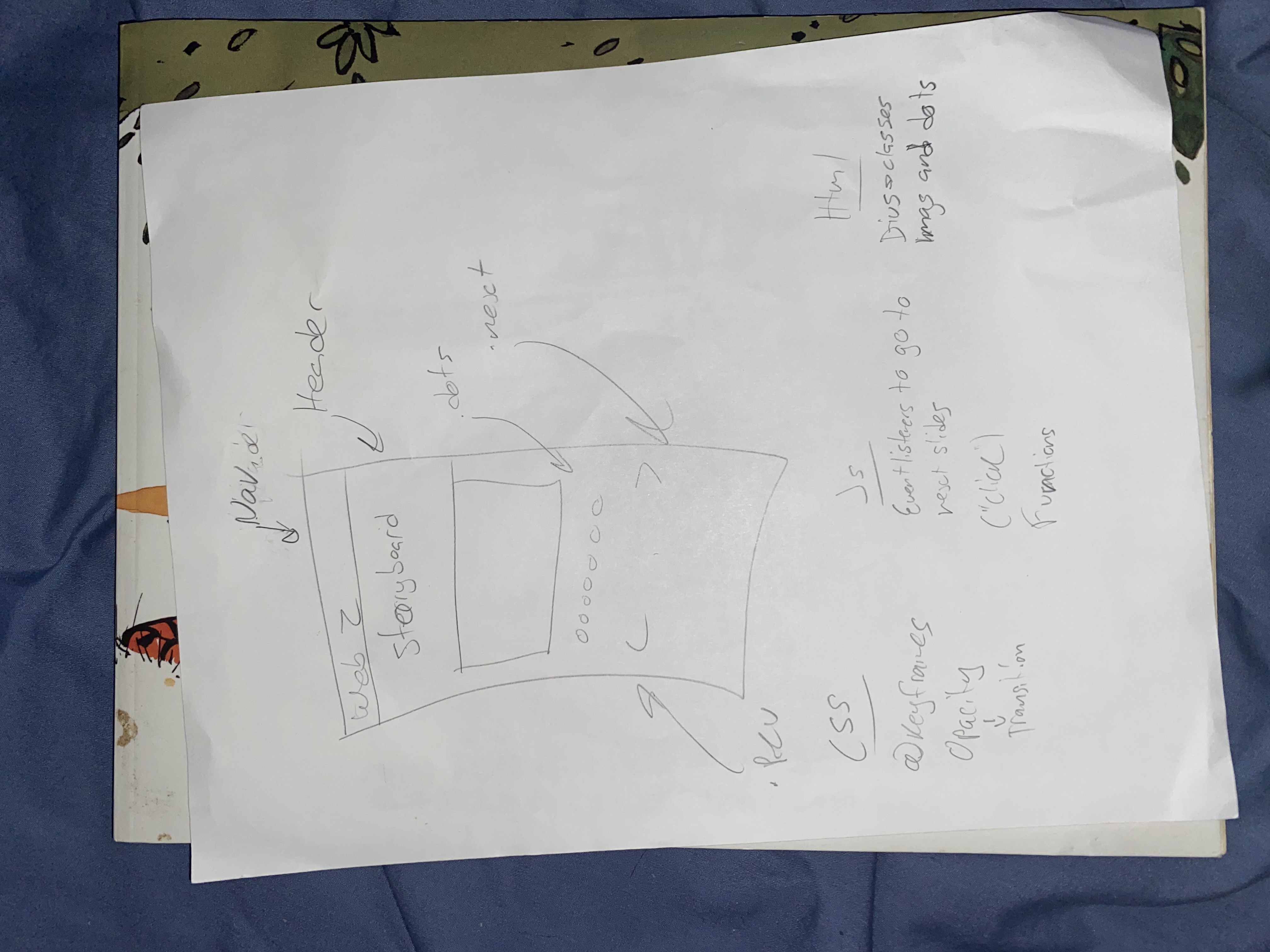
This was the original sketch for the site.
Thoughts and feedback
I thought that this was a really fun final project to work on because I believe that we've learned a lot about Javascript from this. Which inclued Let, functions, addEventListeners etc.
For feedback that I got it was mostly about the positioning of the arrows and the change in size of the images. Because at first the arrows were behind the images so I jsut had to move them down using css. But for the resizing of the Images I had to go back into LightRoom and re-crop all of the images to the same size so that they don't change in size. In the end it looked a lot better and neater then it did before.
Code
JS
let slideIndex = 0;
let slides = document.querySelectorAll(".mySlides");
let dots = document.querySelectorAll(".dot");
let container = document.querySelector(".slideshow-container");
let next = document.querySelector(".next");
let prev = document.querySelector(".prev");

next.addEventListener("click", showNextSlide);
prev.addEventListener("click", showPrevSlide);
dots.forEach(function(dot) {
  dot.addEventListener("click", navigateDot);
});

function navigateDot(event) {
  slideIndex = event.target.dataset.id - 1;
  showSlide();
}

function showNextSlide() {
  slideIndex++;
  if (slideIndex >= slides.length) {
    slideIndex = 0;
  }
  showSlide();
}

function showPrevSlide() {
  slideIndex--;
  if (slideIndex < 0) {
    slideIndex = slides.length - 1;
  }
  showSlide();
}

function showSlide() {
  container.style.transform = `translateX(-${slides[slideIndex].offsetLeft}px)`;
  for (let i = 0; i < slides.length; i++) {
    if (i === slideIndex) {
      slides[i].style.display = "block";
    } else {
      slides[i].style.display = "none";
    }
  }
}

window.addEventListener("resize", showSlide);
showSlide();
CSS
    main{
        margin-top: 100px;
    }


    * {box-sizing: border-box;}

    .slideshow-container {
      max-width: 500px;
      position: relative;
      margin: auto;
      white-space: nowrap;
      transition: transform 1s;
    }

    .mySlides{
        display: inline-block;
        height: 100%;
        top: 0;
        left: 0;
        max-width: 600px;
    }

    .mySlides{
        height: 100%;
    }

    .prev, .next{
        cursor: pointer;
        position: absolute;
        top: 60%;
        width: auto;
        margin-top: 70px;
        padding: 16px;
        color: white;
        font-weight: bold;
        font-size: 18px;
        transition: 0.6s ease;
        border-radius: 0 3px 3px 0;
        user-select: none;
    }

    .next{
        right: 0%;
        border-radius: 0 3px 3px 0;
    }

    .prev:hover, .next:hover {
    background-color: rgba(0, 0, 0, 0.8);
    }

    .text{
        color: #f2f2f2;
        font-size: 15px;
        padding: 8px 12px;
        position: auto;
        bottom: 8px;
        width: 100%;
        text-align: center;
    }

    .numbertext{
        color: #f2f2f2;
        font-size: 12px;
        padding: 8px 12px;
        position: absolute;
        top: 0;
    }

    .dot{
        cursor: pointer;
        height: 15px;
        width: 15px;
        margin: 0 2px;
        background-color: #bbb;
        border-radius: 50%;
        display: inline-block;
        transition: background-color 0.6s ease;
    }

    .active, .dot:hover{
        background-color: #717171;
    }

    .fade{
    animation-name: fade;
    animation-duration: 1.5s;
    }

    @keyframes fade{
        from{opacity: 0.4;}
        to{opacity: 1;}
    }
     h1{
        color: white;
        position: relative;
        margin-left: 10 0px;
        margin-top: auto;
        margin-right: auto;
     }

     @media screen and (min-width: 60rem){
        h1{
            position: relative;
            margin-left: 550px;
            margin-top: auto;
            margin-right: auto;
         }
        }